And the winner is….[Help us choose a new book cover design!]
Update May 1st, 2013: Based on your response posted here in comments, on Facebook and the now hundreds of emails I’ve received on the topic of the new cover design, the clear winner is:
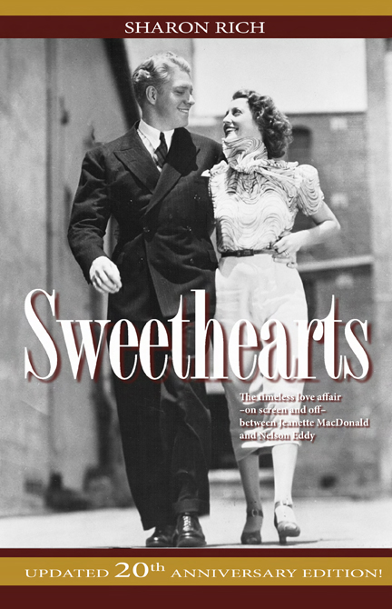
Of course, all of the covers received tremendous support and valid comments as to the pros and cons. We will be using some of your favorite other shots on the back cover of the book as well.
Thank you to everyone who participated in this survey.
And, as requested, I am looking into the option of offering a few different covers for the collector who would like them all. Stay tuned!
Update April 19: At the moment the 5th cover option is the winner by a long shot. However, since a few people have requested we try the candid of Jeanette and Nelson together during “Smilin’ Through,” I’d like you to take at look at the new 6th cover. If you had to choose between cover #5 and #6, which would be your favorite? Please take a look and leave your feedback either as a “comment” to this post, or email us with the link below.
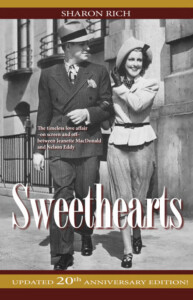
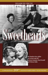
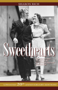
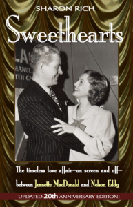
Next year marks the 20th anniversary of the publishing of the book Sweethearts. We are surveying with you for a new cover for the next edition (designed by our wonderful graphic designer Don Schumann). (And yes, we are preparing a Kindle edition as well for later this year.) Please look at the photos below (you can click on them to see them larger) and email us which choice you would like for the cover…or if you have a couple of favorites, let us know which ones you like, in what order. Do you prefer using any photos from the current book cover? Or, if you have any comments about a different photo or design to use, let us know that as well. Thanks for your input!
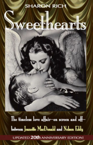
Cover #5 below.
Cover #6 below
Viv
February 13, 2013 @ 5:56 pm
Sharon I like the first but not sure if it is right, I probably would go for the Rose Marie photo, their best known Film.
MHO. Viv
mawgie1
March 22, 2013 @ 2:13 pm
Looks like I’m the only one who prefers #5. I love the way they are looking at each other instead of where they are walking.
maceddy8
March 22, 2013 @ 6:33 pm
oh boy- sharon i love number 1 but perhaps if you want a candid it would be number 5..i also love the rose marie cover #3 sorry !!!
Anne
April 19, 2013 @ 4:48 pm
Sharon, I like the No 6 cover that has just been added. It is so reminiscent of the way they felt about each other.
mariaae
April 19, 2013 @ 11:18 pm
Hi Sharon: I LOVE # 5. They were so young and happy at the blossom of their romance, still unencumbered by the cruel forces that would eventually derail their plans for a happy future. It brings to mind a Nelson quote from your book Sweethearts on page 402 of the second edition: ” We were so young and bright in those early days. Everything was new, falling in love for really the first time in our lives.”
Maria Escano
kathy
May 3, 2013 @ 12:25 am
Sharon, my choice is definitely #5 and no other. I love it. The way they look at each other is so revealing.
kathy
drdave
February 13, 2013 @ 6:04 pm
I think cover #2 is the most appealing. Its shoes Jeanette and Nelson in their prime and there is just an
energy and happiness about the candid photo which warms the heart to look at. I would vote for cover #2
Dr. Dave
San Marino, California
Tefi
February 13, 2013 @ 6:44 pm
I like Cover 3, it’s the most romantic.
Stephanie
Brazil
gillieb
February 13, 2013 @ 9:12 pm
I CHOOSE COVER NUMBER THREE FOM THEIR FILM ROSE MARIE.
Florence
February 13, 2013 @ 9:15 pm
I like Covers 2 and 3, but believe that I really favor Cover # 3.
Florence
Pittsburgh, PA
gillieb
February 13, 2013 @ 9:22 pm
MORE ABOUT THE NEW COVER–THE OTHER COVER SUGGESTIONS ARE CERTAINLY RELEVANT, BUT THE ROSE MARIE PERIOD IN THEIR LIVES SEEMS PATICULARLY SIGNIFICANT. QUESTION, WILL THERE BE ADDITIONAL CONTENT INFORMATION IN THE BOOK ABOUT THEIR LIVES?
scottlevine
February 13, 2013 @ 9:44 pm
I like Cover 2. It has a more contemporary feel than some of their costume shots.
marion elizebeth
February 13, 2013 @ 11:06 pm
The first one is so striking, it looks like it would be a book about angels but the 2nd and 4th are the ones that I would consider because they are candid shots of Nelson and Jeanette not just publicity shots from their movies. Over all I think I would choose #4.
cep
February 14, 2013 @ 12:44 am
I prefer cover number 4 because it includes shots from both their professional and personal time together (which was mentioned on the book cover). However, as many have mentioned that Rose Marie is one of their more famous pictures you could replace the New Moon photo with the Rose Marie photo.
Zsu
February 14, 2013 @ 12:47 am
Cover # 4. Nelson and Jeanette reminds me of Tristan and Isolde and the malevolent men who destroyed their love. Cover 4 expresses both joy of the fullness of their love while also seems to forewarn that jealous authoritarians seek to thwart their love.
ledsham@msn.com
February 14, 2013 @ 3:41 am
Cover no. 1 is so romantic and so is no.3 hard to choose..
trinajane
February 14, 2013 @ 10:37 am
#3; The location (Lake Tahoe) best captures the beginning & flowering of their love story, and remained in the heart of their relationship all of their lives.
Cathy
February 14, 2013 @ 11:16 am
Hi I like #3, it resembles a happy quiet time away from the lime light, something we could all relate to.
brandypurdy
February 14, 2013 @ 10:42 pm
I like cover 1 best, i like the draped curtain background it makes it stand out. I also like the smaller image from New Moon on cover 4, however as a published author myself I know it doesn’t always come down to personal taste, so an image from Rose Marie might be more popular from a marketing standpoint.
janet
February 15, 2013 @ 11:04 am
I think all the covers are very nice, but I have to say that #2 is my favorite. I love the “deco” buildings in the background… it looks like it was taken at M-G-M.
kathy
February 20, 2013 @ 8:07 pm
I love cover #3. However, on the current cover I also love the bottom right phote showing J&E kissing. Love the smaller image from New Moon on cover 4.
This is a hard choice for us to make, sharon!
Have any personal Jeanette or Nelson stories to share? | Jeanette MacDonald & Nelson Eddy Home Page
March 6, 2013 @ 2:11 pm
[…] for the new edition. If you’d like to add your input on that, they are available to view here. As of this writing, between comments on the post and emails sent to us, there is no clear […]
torim
March 8, 2013 @ 2:58 pm
Although I love all the covers, I would go with cover #2. I love the candid shot and I think it will lead others to ask about the book I’m reading and allowing me to tell people about who these two were. Obviously, we as fans know that covers #1 and #3 are from their movies, but if you don’t know that they look like they could be a romantic novel cover that you find at the grocery store. As a person who would be reading this out at the beach or somewhere out in public, I would rather have it not look like I was reading a romantic novel as passerbys judge my book by it’s cover. Don’t mean to sound harsh, but that’s how I see it. Cover #4 would be my second choice.
joanne tew
March 14, 2013 @ 6:31 pm
I think 1 or 3
ccrod
March 22, 2013 @ 10:33 am
Look at their faces in cover #5!!!! This is them in REAL LIFE! This photo says it all. Defintely want #5. 🙂
~Cee
torim
March 22, 2013 @ 11:40 am
#5 definitely!!!
metromoviestar
March 22, 2013 @ 12:18 pm
#2 and #3 are my favorites, for different reasons, but they are both beautiful!
I’m no help!!
😉
Katie
Mimi
March 22, 2013 @ 2:26 pm
Hi, everyone! I vote for cover number one–hands down. The ultimate goal is to attract new readers to the world of Jeanette and Nelson. Newbies to their romance will be attracted by the cover on this one. I would suggest the background be a lavender or shade of blue instead of that green color. Unfortunately, in these times, sex sells and that is a very sexy cover. I had read, also, that one of the “Angel” promo pics was Jeanette’s favorite photo of herself. Best wishes to all! Keep up the great work!
Judith
March 22, 2013 @ 2:52 pm
…if you are led by the Spirit, you will be in no danger of yielding to self-indulgence, since self-indulgence is the opposite of the Spirit, the Spirit is totally against such a thing. … When self-indulgence is at work the results are obvious: fornication, gross indecency and sexual irresponsibility, etc. … I warn you now…those who behave like this will not inherit the kingdom of God. What the Spirit brings is… love, joy, peace, patience, kindness, goodness, trustfulness, gentleness and self-control… Galations 5:16-23. Paul’s words are as true today as was then, and are good rules for everyone, not just Believers in Jesus Christ and God. These end times call for a Spiritual Revolution, Spiritual Believers to hold the high road, not as we are experiencing today in grossness of sexual revolution, which is detrimental to the person and Spirit. There is a TV show, “1,000 ways to die,” and one was of a man who died from his sexual appetite. “Knowledge does not comprise all which is contained in the large term of education. The feelings are to be disciplined, the passions are to be restrained; true and worthy motives are to be inspired; a profound religious feeling is to be instilled, and pure morality inculcated under all circumstances. All this is comprised in education.—Webster.”
Anne
March 22, 2013 @ 3:47 pm
Sharon, I like the new cover from Angels but I have a suggestion. How about the picture taken on location for”RoseMarie” where Nelson is smoking his pipe and looking at Jeanette and she has her daily flowers on her lap. It’s very evocative of what was happening.
Viv
March 22, 2013 @ 8:36 pm
Still prefer 3 Sharon, their best known film people might connect with. Viv
chelseakruger
March 23, 2013 @ 2:23 am
I hate to go against everyone else, but I like any of the better than the first one. I just can’t get into the wings. I absolutely love #5 though!
newkirked7
March 23, 2013 @ 7:38 am
Sorry to disappoint but they are ALL great!
3 or 4 would be my favorites though.
r.dennett@hotmail.co.uk
March 23, 2013 @ 1:27 pm
Sharon, I think they are all lovely, but 5 is one not taken films, shows them out together looking very much in love.
brandypurdy
March 26, 2013 @ 10:15 pm
I still like cover 1 the best, but I stand by what I said before as an author myself sometimes marketing rules over personal preference and maybe something from Rose Marie might be best or one of those beautiful shots from Maytime where Jeanette is in the lacy gown like on page 170 of the current paperback edition. Or the Rose Marie picture on the back cover of the current edition.
patti
April 2, 2013 @ 7:32 pm
Sharon, I like #5 the best, it does not identify with any of their films and yet the look of L O V E is
in their eyes.
Nan
April 10, 2013 @ 7:59 pm
I was just wondering if a new cover has been selected yet. I think I did vote but to be sure I like number 5. They look so very happy to be with each other….not to even notice where they are going as long as it is together!
Nan
lovesong
April 19, 2013 @ 3:07 pm
The choice is a difficult one, but option #6 would be my first choice, with #5 a second choice. Option #6, in my humble opinion, captures their feelings for each other that we have seen them express in their music.
ccrod
April 19, 2013 @ 8:10 pm
#5 should be the cover because it does not show them on the set of any film they were making…it’s them in real life and that is what this book is about. Thanks Sharon for allowing us to take part in this decision. Whatever you choose will be great! ~Cee
gillieb
April 19, 2013 @ 10:12 pm
THANK YOU FOR INCLUDING US IN THIS DECISION. I LIKE BOTH 5 AND 6. NUMBER 6 HAS THE BEAUTY AND LOVE OF TIME IN THEIR LIVES. NUMBER 5 SHOWS JOY OF BEING TOGETHER
newkirked7
April 19, 2013 @ 11:02 pm
I like no. 6!
brandypurdy
April 20, 2013 @ 2:08 pm
To be honest, I don’t like 5 or 6 much for a cover photo, if you want a candid I would go with cover 2, but if I had to choose between 5 and 6 I would pick 5.
kathy
April 20, 2013 @ 8:15 pm
I love #5 sharon. It says so much.
kathy
catebar44
May 3, 2013 @ 1:30 pm
Difficult to choose, but I like the eye contact and smiles in #5. It says it all.